If you’ve ever been to an Apple store or have held one of their products in your hands, you’ve felt that sense of luxury and premiumness.
It’s not the numbers or the spec sheet that make customers pay for an overpriced phone; it’s marketing and the way they brand their whole company.
So how do they do it? And what can you do about it?

The Apple Store Experience:
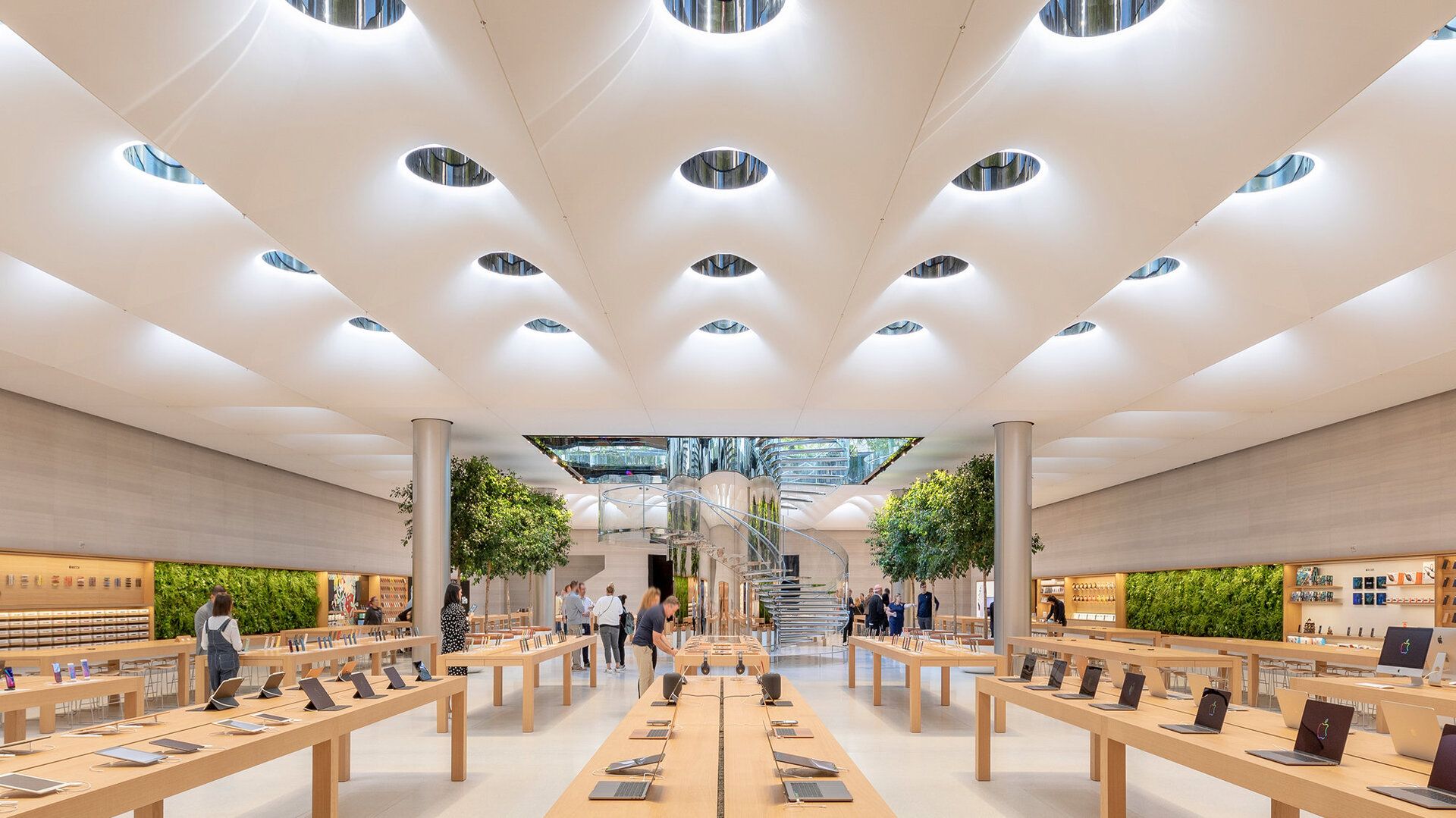
The towering, glass door resists your strained pull. It slowly reveals itself to an expansive space. Walls are made of thin glass that supports the heavy roof.
The room is dotted with oak tables with a few products on display. As you walk around, you notice how scattered the iPhones are on each table.
Every employee in a blue shirt is tending to each customer with care.
The place is immaculate. Almost otherworldly. How could you not marvel at the products?
So, what makes this store so different than any other you’ve been to? It’s a combination of material use, composition, and lighting.
Pay attention without diving into the products themselves, and notice how every table, piece of furniture, and product is evenly spaced with great attention to detail.
That spacing is what gives each iPhone its own aura. Every table is a unique section to discover; it draws you in.
Now imagine the whole store, with the products crammed into a few tables, everything scattered, and the even spacing nowhere to be seen.
It’s the same product but a whole different idea. See what I mean?
The whole place is made of leading lines; everything appears straight and in orderly fashion. It’s clean and minimalistic.
ATTENTION!!!
Share this newsletter with ONE friend who would love to read it and earn a general guide on how to purchase a tech product, how to make the right decision.
Lighting & Material Use:

Apple has designed its brand around the idea of minimalism and balance. Our eyes are drawn toward balance; it attracts us.
They’ve implemented this principle in the way they compose their stores, products, and websites. Material use and lighting only complement everything else to create a bigger picture of balance and trust.
Look carefully at the Apple store again and notice how they consistently use cool, muted, and consistent colors.
The way brands choose their color is a complex process that relies on a fundamental principle of color theory. Color can evoke the right emotions when used effectively.
In Apple's case, they’ve chosen colors that evoke emotions of balance, stability, and trust. With a solid color palette (or color arrangement), they’ve chosen specific materials to complement the colors.
Shades of oak, scattered greenery (evokes eco-friendliness), glass, white marble, and grey aluminum steel. These are all materials that strongly complement the idea and emotion Apple is trying to convey.

Light might seem like a simple idea, but it is a complex concept that plays a crucial role in graphic and visual design.
Like the rest of their design, Apple has chosen a simple lighting setup in their stores to complement the idea behind the rest of their design: balance and stability.
They make heavy use of natural light from the outside to give the place a soft, daylight hue, to reduce sharp shadows, and further emphasize trust and transparency.
Apple’s Product:
Apple is known for its products, not its stores (in the bigger picture). This is where their signature design and branding shine most.
Take the iPhone, for example: it has a minimalist, sleek design that doesn’t shout to grab attention; it attracts attention without a word.
Their iconic design has been so influential that you can clearly see the impact in other brands such as Google and Samsung.
We can more clearly define what makes something Apple with their laptops. Everything to the touch is carefully designed to feel premium. The hinges have on-point resistance, the touchpad has a perfect glassy feel, and the metal casing has quality inscribed on it.
The quality of Apple's materials, design, and aesthetics is something other companies always have to catch up on.

What clearly defines their aesthetic is minimalism, which they achieve primarily through bezels (or curves, for simple English). They add the right amount of bezel to every corner to give it a soft, gentle, but also demanding appearance.
Lighting still plays an essential role in their product marketing. You’ll notice that in the still shots, they emphasize soft lighting, but in the video advertisements, they use sharp lighting effects to promote unrivaled performance.
Lighting, material, and composition, when used correctly, can be powerful tools for telling a story, establishing a brand, or evoking emotion.
Next time you hold an iPhone product or visit their store, think about it.
What have they done?
What do you feel?
In the meantime, sit back, relax, and start reading all our previous articles tailored just for you.
Don’t forget to comment, I know you have things to say!